Friday, 30 November 2012

News package structure.


 This is just a quick look at the structure of our news package.

Voice over/filler shots – to introduce the topic and use the filler shots to intrigue the audience.
Interview - with a parent for a personal yet specific opinion on the news topic.
Voice over/filler shots- to transition between interviews.
Experts Interviews- with a NHS consultant for an opinion on the news topic from a professional point of view. (This may be assisted with a diagram/animation)
Facts and Stats graphic and voiceover- to extend the professional aspect and provide the audience with the reality through facts and statistics in an interesting way.
Vox Pops- to give the public a voice and get more input into the topic, to present how current situation is and how it affects society.
Conclusion/voice over – Up sum to end the package

Initially, we decided to do a 'piece to camera' at different points in the news package, but decided against it, as we recognized how effective it could be without, as it would keep a professional constant flow in the voice over. 

#JA

Thursday, 29 November 2012

Vox Pops


To fulfil this task, as expected we will need a variety of equipment to allow us to achieve our aims.

The equipment that were going to include when recording our vox pops are...

Camera Recorder


Tripod


Clip Microphone


S.M

Creating 'Press Red' Sign

In our news package we are going to include a press red sign which will be placed in the top right hand corner of the screen in order to create a sense of professionalism which will give our news package the edge to other news packages. So in order to accomplish this task I had to use adobe photo shop to create the press red sign. As you can see below it shows the final completed press red sign.

The first step in achieving this sign that CLN needed was that I inserted a rectangular shape which I inserted the text 'Press' and the red circular shape which I edited a bit in order to get that 3D look. 

By Akin Aydin


Friday, 23 November 2012

Reasons for choice of background on blogger

Blogging from the library, i will be explaining the reasons to why we chose to use the background that there is for our CLN blog.

As the background is blue mystic smokes on a black surrounding, we took this time to think and imagine how this picture could relate to our CLN news report project and our storyline.

As our news report scenario is based mostly on health and cigarettes, with my imagination we had this vision where we visualised that the blue smokes could be representing the smoke thats being exhaled from the people who smoke, this analogy gave a more deeper prospective to our CLN news report and makes it clear of our purpose right from the start to the background and its meaning behind the picture down to all the blog posts.

The image you see on the left is the background that has been used on our CLN blogger.


S.M

Website/webpage sketches for CLN

Blogging from home, here you can see I have drawn a sketch of what may be a possible look for our CLN website, reason being i have done this is to give myself an idea and a vision of how the website will look in appearance, after making the sketch i will analyse some positive and negative aspects of the drawing and then take some points on board to implement on the real website.

On the sketch i have drawn for our CLN website as a rough guideline i have included elements such as mandatory buttons to navigate around the website, the buttons consist of the "Home" "About us" "Health" and "Finance" the home page is the main page where everything can be located such as the latest news, live video streams of coverage on news, furthermore links that take you to stories relating to smoking, money, fitness, transport, nightlife, entertainment and technology, so in other words simply everything that covers life in the city.

Furthermore elements on the home page would be a search bar to search internally on the website if a user is having trouble of finding a certain thing through navigation of links and so on, in addition there is a weather forecast which shows the weather for the day from the morning through out the night.

On the "About us" page is information based on the group behind CLN, details will include things such as when the news company was established, who are the main people that formed the team and the company, as well as the amount of staff that work for the company, and their speciality etc.

Moving on to the "Health" page as obvious as the title makes it, this page will be covering information about health tips and facts, and ways to improve health through exercise and diet.

The last page "Finance" also from the heading makes it clear what information will be held on this page, this page is dedicated to information about the economy, money issues and ways to save money and manage money to last longer and so on.

Based on my sketch, if the group and i were to follow whats on the paper, throughout the website the CLN logo and the landscape of the city in London will be presented always on the top of the page in the header, and the social network links displayed at the bottom, such as Twitter and Facebook and lastly a YouTube link as well.

This is what the final preview of the drawing sketch looks like.


Here as you can see above is the same drawing sketch of the website but with annotations to explain what each part is and the functions and features on the website and so on.

KEY:

Going in clockwise order from the diagram.

  • Blue = CLN logo
  • Green = Central London landscape
  • Red = Latest news slide show
  • Purple = Live video coverage
  • Turquoise = Different story topic links
  • Orange = Social network links e.g. Twitter & Facebook + YouTube
  • Brown = Weather forecast
  • Pink = Search bar
  • Grey = Website buttons


S.M

Tuesday, 20 November 2012

Opening Title Sequence: New Direction

Right, in my last post around editing, I explained how we covered the top screen with a blue shapes. Turns out, it did not turn out as well as we planned it to be. So I've removed the titles and the shape itself, in order to fit in an alternative inside of it. Sadly, I'm going to have to leave the editing for the title sequence for a bit to focus on the actual news package, but I will eventually have it done to fulfil it's potential and make it the best opening it can be.

#JA

Friday, 16 November 2012

Analysis of news packages - Sky+ITV

Today in class i will be focusing on analysing and explaining certain things about news packages such as the layout of the clips and how they are presented, and also the different features they might incorporate which could possibly be the following:
  • Piece to camera
  • Voice over
  • News strips
  • Filler shots
  • Interviews
  • Expert interview
  • Facts & statistics
  • Vox pops
all the above elements are what it takes to produce a high quality news package, and my job is to research and find out what news companies resemble to these elements and what they lack in by which i could suggest future improvements, overall as a conclusion after having evaluated some news packages by that my group and I will contemplate and consider to include all the essential elements to try and make our news package of highest quality.

so starting with Sky i will now advance to explain in detail their news package.


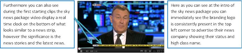
Overall Sky have done a fairly good job in terms of their news package consisting of some features that a well structured news package would have, this includes news strips with detail and voice overs, filler shots, interviews and expert interview.

ITV

Now i will be moving onto ITV's news package to go through their features they have on their video.


Here as you can see ITV's news package in comparison to Sky is much less in detail, and incorporates less features, also their is a lack of vision in terms of how much is presented on the screen, making ITV's news package have a lack of interesting aspects and come across to be quiet dull.

S.M