starting of with the BBC website:
Here as you can see on the BBC website you can see immediately it is well arranged with an effective white background colour that helps to make everything else stand out, with a useful technique of navigational buttons that transfer you left and right to big topics currently in the media, the BBC logo is well established on the top left corner giving their mark on the public, and the current time and date that updates automatically, in addition a bonus of having a real time clock, furthermore displaying a 5day weather forecast with a search tab at the top right corner being able to search anything within the website that you struggle to find normally, along the top of the page is a row of hyperlinks to different pages within the news sector such as the general news, sport news and weather news plus being able to access the iplayer for any shows or news you missed out to catch up on.
This is the bottom section of the BBC news website which simply demonstrates the most popluar watched shows on the BBC, as well as also choosing to display the most popluar listened and read.
You also get live coverage of whats on the BBC in terms of tv shows and radio sessions with their timings displayed. Lastly on the bottom right of the BBC news website under the "Explore" heading their is a list of different pages you can access from A-Z.
I will now move onto the sky news website and their design and layout.
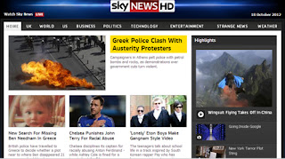
Here as you can see on the Sky news website it is also well organised with the Sky news logo right at the top centre of the page giving their image, similar to the BBC news website with the date displayed on the top right corner, however no time or visual clock, nevertheless sky have a feature on their website that allows people to watch sky news live on the top left corner, and also a row of numerous tabs and links running along the top of the page starting with the home page, news in the UK, world news,  US news, business, politics, technology, weather news and entertainment. Unusual enough Sky also have a news page on their website called "strange news" which is unique as other news websites do not have this page.
 US news, business, politics, technology, weather news and entertainment. Unusual enough Sky also have a news page on their website called "strange news" which is unique as other news websites do not have this page.
From this you can see Sky have a very wide range of news genres, something for everyone.
At the bottom half of the Sky news website their is a video timeline showing videos taking place around the world, watch live sky news, and also the last 3 minute catch up for a news bulletin, with more top stories of news related information and a function known as "trending" which im assuming is another word for popular, major stories from 1-9
Lastly I will take you through ITV's news website.
Here as you can see in comparison to the BBC and Sky news website the ITV news website come across to be more simple and plain whereas BBC and Sky are more in detail, despite that, ITV does have the logo on the top left corner with the links of different pages running acorss the top of the page and also a search bar on the top right corner.
The main aspect that gets drawn to my attention on the ITV news website is the top news section at the top with thumbnails and a note under each picture breifly describing what each topic is about, in addition ITV have a very unique and effective feature on the website as it shows live news streams being updated 24/7.
In conclusion the best news website in terms of how much information is provided and how well the website has been structured and its appearance in the following order has got to be BBC, Sky and then ITV.
S.M


No comments:
Post a Comment