
starting with BBC i will be going to analyse how their news title sequence is introduced and so on:
 Then the camera starts spinning on different angles of the globe giving us a 360 view with effects of white and some hints of black rotating circle lines engraved deep on the surface of the globe, which gives of fine details making it look like whirlpools, furthermore the globe at this point is really big and is covering the majority parts of the screen where its hiding the BBC logo on the bottom left which then starts to emerge in the next screen shot.
 We then move onto seeing a combination of white and black spiral lines wrapped around the globe where the globe is also split into levels of swirls with the same colour as the actual BBC logo where the BBC logo then suddenly pops up from the bottom left corner shortly after the globe shrinks in size to focus the attention on the logo with the three individual letters in their own box and "NEWS" written in block capitals in white with a square background coloured in orange.
 Lastly after the BBC logo has been noticed it then starts to disappear and the globe starts to rotate to another part with swirl lines going all the way from the top to the bottom and slowly fades away.
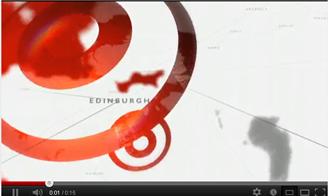
I will now move onto Sky and analyse their title sequence and how they went about it:
 Here as you can see at the start you can already tell that blue is the primary colour in the sky title sequence from the different shades of blue spread around the start of the clip from the earths view from space with a white line run across the globe and the effect of the sun used as a light source from the edge of the earth.
 You then start to see the sky banner appearing from the side in a diagonal slanted view with the word "sky" in black bold font on a white background and the "news" written in bold white font on a red background while still seeing the earths view in the surrounding.
 Then the sky banner continues to come out and labels itself at the centre of the picture with streaks of light blue lines run across from side to side and top to bottom over the sky banner with the light still shining behind the sky banner.
 After having seen the sky banner there's a rotating transition that spins around the earth clockwise while showing us the details of the earth from space and being able to see the clouds as well as still having the swirl blue and white lines across the earth and the strong light emerging from the corner.
 We then eventually get back to the starting point to the sky banner as the camera continues to spin back to it normal position, at this point the title sequence is looking at its best with the most detail on screen with the earths view in the background and the sky banner placed in the middle of it with the lights effect from the corner shining on the banner in addition to the blue and white spinning lines wrapped around the whole picture taken all in once clip.


Last but not least I will talk about the final news title sequence which belongs to ITV and their pattern in style:

Here as you can see in the beginning the first thing that's brought to our attention is the ITV logo right in the middle of the screen with the letters "ITV" belonging to themselves in black bold font on a yellow background and the word "NEWS" also left single letters are printed on white bold font however with no background and simply blended into the surrounding and also unusual is just a yellow block at the end so from
this we can tell that ITV's theme colour is yellow and a bit of white and black, we can also see at the top corner of both sides are flashing lights.
 Shortly after the appearance of the ITV logo that was displayed on the screen for a few seconds it then goes to a slide transition on the left very quickly.
After the disappearance of the ITV logo we are then presented with a hallway of galleries of pictures that whatever is displayed on the cover that is the subject of the story on the news, here the transitions are very unique as it goes left and right as if your walking down past these pictures, you can see in the background that the rest of the other pictures are dark because their not the main topic in the moment so only the pictures that are displayed light up as its the
biggest headlines.
 Here as you can see after going through the gallery of pictures your taken to the end of the hallway which is shown to be plates or screens that your taken into that slowly start to open up like a book and reveal something.
  Finally at the end of going through the hallway and being directed into what seems to be a portal that transfers you to a new place and as you can see in this case it takes you to the news reporters desk where he begins to talk about the news and so on.
S.M
No comments:
Post a Comment